Assignment 1
De Stijl Poster

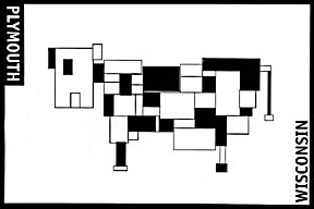
Instructions
To design a poster in the style of DeStijl. This will be done completely in Adobe Illustrator. The content can be totally abstract and/or a subject of your choice.
Objectives
To familiarize yourself with the DeStijl movement. To familiarize yourself with some graphic design basics related to fundamental design and layout. To proficiently create a new document, draw shapes, set type, rotate objects and scale objects.
Guidelines
Design an 11'x17" vertical or horizontal poster. You cannot use photographs, gradient blends or continuous tone effects. Due date is Monday, February 17 to be critiqued electronically. You will have one more week to re-work based on critique. On Monday, Monday, February 24 you will submit a 11x17" printed, trimmed, full color copy. I will discuss in class. You can only work in Illustrator for this assignment. It has to be trimmed to exactly 11x17"
Assignment 1 Issued:
Monday, January 27
Assignment 2 Issued:
Russian Constructivist Book cover
Wednesday, February 12
Assignment 1 Due:
Monday, February 17
Group critique done electronically
Monday, February 24
Deliver a hard copy to Professor Pirman
-TOP-
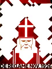
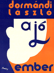
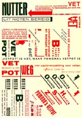
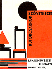
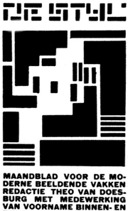
De Stijl
I. Order
A. Straight lines and right angles
B. Harmony - Equilibrium
C. White space
D. Balance and tension
E. Primary colors
II. Geometry
A. Straight lines and right angles
B. Squares and rectangles
C. Grid
D. Elementarism
• Graphic sense of paintings, books, and typographic communications
• Influence Bauhaus typography
• Harmony, equilibrium, primary colors, straight lines and right angles
• Cubism, ultimately refined by the De Stijl carries its attitudes about line, space, color and volume into typography
•Art was a social function and existed to serve the welfare of society
• Absorption of pure art by applied art
• Van Doesburg - theory of elementarism which admitted oblique effects
• Combine dynamism and order into paintings and typography
• Intensity has replaced direction - typographic support of text versus ornament
• White space, text, color and the photograph
• Division of space with geometric order, vigor, and beauty greatly influenced advertising and graphic design in the United States
•Primary colors with black and white, and shapes and forms were limited to straight lines, squares, and rectangles
• Mondrian constructed compositions of asymmetric balance in which tension and balance of elements reached absolute harmony
• Dynamic movement in equilibrium
• Equilibrium can only be established through the balance of unequal but equivalent oppositions
• Science, technology, and political developments would usher in a new era of objectivity and collectivism
• Scientific theory, mechanical production and rhythm of the modern city
• Absorption of pure art by applied art
• Curved lines eliminated and sans serif typography favored
• Type often composed in rectangular blocks
• Assymetrically balanced layouts composed on an open implied grid
• Red favored as a second color because of its graphic power to compete with black
• Elementarism - diagonal to be a more dynamic composition principle than horizontal and vertical construction
• One the dominant directions of graphic design has been the application of this geometric sensibility to bring order to the printed page
•Pure line, shape, and color to create a universe of harmoniously ordered, pure relationships
-TOP-
|